Digital transformation for corporate Christmas card supplier
The Challenge
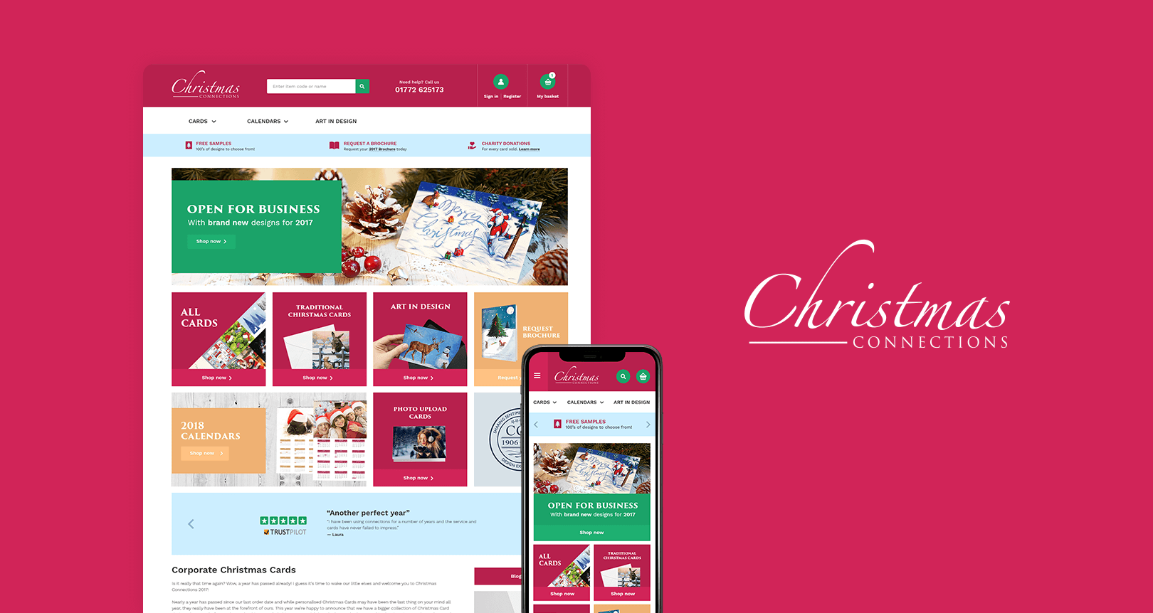
I was approached with the challenge of re-designing a corporate Christmas card supplier that’s sales had started to drop as a result of a dated, tired and non-user-centered website. Through research, prototyping, user centered-design and testing the Christmas Connections website saw a 30% uplift in sales in the first 3 months after putting the new site live. View website
The Solution
A mobile-friendly user-focused digital approach
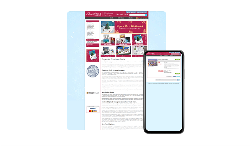
The existing site was in dire need of a refresh both aesthetically and the user experience, it wasn’t responsive so mobile visitors were having to use the outdated desktop version. As the sole UX designer on the project I took it upon myself to implement varying feedback, user testing, and visitor analysis data collection methods before starting on the complete UX overhaul.
ANALYSING THE LEGACY SITE & VISITOR BEHAVIOUR
The existing site was dated, there was no Google Analytics installed, or any other data I could trawl through. I installed Hotjar onto the site, as well as Google Analytics and began collecting data, visitor behavior recordings, heatmaps, and user feedback – I then set out to map any issues, pages with high bounce rates and patterns in user behavior which formed the basis of the UX direction.
wireframing, prototyping & TESTING
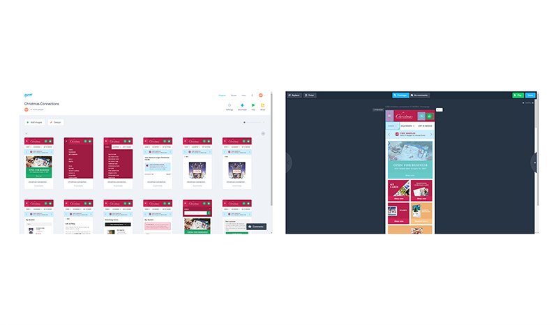
Due to a tight Christmas deadline and strict orders from the stakeholders at Christmas Connections to keep the site architecture the same due to legacy issues, I moved onto high fidelity prototyping – each page was crafted to a near handover ready level and put into Marvel app for testing with internal stakeholders and external subjects.

a focus on mobile user experience
The existing Christmas Connections website was not responsive at all, the revised website features a fully responsive experience, every page was optimised across various resolutions to provide the best user experience.

full user account and staff section
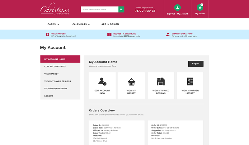
As well as front-end pages there were several back-end pages that needed to be worked on including a full user account section and staff telesales area – I spoke with several team members and some regular customers about issues they faced with the current system and used these to design a more user-centered account area.
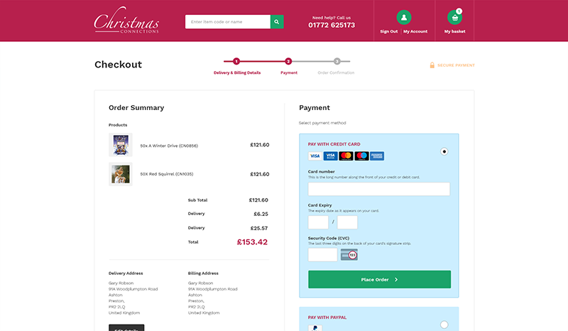
testing and optimising the checkout
There were checkout limitations due to the old shop being built upon legacy PHP technology, after putting the first version of the site live and monitoring performance I noticed some improvements that could be made and passed these through to the development team, as a result, the checkout conversion rate increased substantially.
The result
30% increase in overall sales in the first 3 months after putting the new site live.
